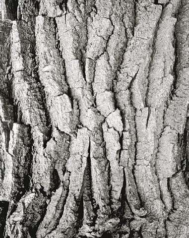


Cottonwood Bark, V2
- Location
- near Brady, Nebraska
- Equipment Used
- 8x10 Deardorf, 9.5 inch Goerz Dagor lens
- Film & Developer
- J&C Classic Pan 400, PyroCat HD 2:2:100
- Paper & Developer
- Azo grade 3, Smith's Amidol
- Lens Filter
- none
| Photrio.com contains affiliate links to products. We may receive a commission for purchases made through these links. To read our full affiliate disclosure statement please click Here. |
PHOTRIO PARTNERS EQUALLY FUNDING OUR COMMUNITY:  |