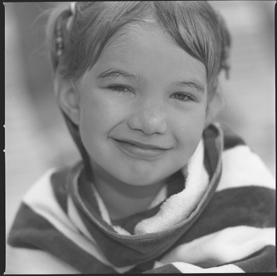
I like the expression here and the use of selective focus, but I think this and most of the other Hassy shots you've posted here could benefit from a little more contrast--maybe extend your developing time by about 20% or print a grade higher. You've got nice highlight detail, which is characteristic of PMK, but APX 100 can produce very solid blacks, and they aren't coming through on these scans. Or maybe try Tri-X, since you seem to be getting a good tonal range with that on the Holga shots you've posted.
Thanks. I tend to print a bit on the _slighty_ less contrast side. This was a neg scan but I'm working on printing about 20 of these kids that I shot. I'll play around with the curves/contrast on other scans from now and give a bit more punch. I used to print all the time mostly on #3 grade (tri-x/d75/1:1/asa200). But I got tired of the contrast and I'm liking the softer grades (2 and 21/1). Perhaps I've gone too much on the other side. Thanks for the comments. They REALLY help me even though monitors can give a different look for each person.
Photrio.com contains affiliate links to products. We may receive a commission for purchases made through these links. To read our full affiliate disclosure statement please click Here.
PHOTRIO PARTNERS EQUALLY FUNDING OUR COMMUNITY:
This site uses cookies to help personalise content, tailor your experience and to keep you logged in if you register.
By continuing to use this site, you are consenting to our use of cookies.