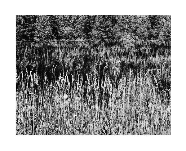
Field
Shawn Dougherty

Field

4x5 contact print.

The light tones in the foreground grass are not paper white nor is there full detail in the top whisps. All comments are appreciated. Thanks for looking.

www.docsfoto.com
Location
Clark, PA USA
Equipment Used
8x10 view camera, 4x5 back
Film & Developer
Tmax-100, Pyrocat HD 3:2:200
Paper & Developer
Azo, Amidol
This is the kind of photography that I fundamentally enjoy... The mixture of the foreground grasses with the trees, water, and resultant reflection is very creative. The problem that I have with this image is the very stark contrast. I know very little about Pyrocat, Azo and Amidol. Is there a way to soften this through printing? Also, it is often advantageous to shoot these kind of scenes just before sunrise or just after sunset to achieve more of a gentle glow that emphasizes the reflection yet maintains detail in the highlights.
 
Thank you esanford! This image is printed on grade 3 Azo with quite of bit of burning and a water bath to bring down the highlights. I think this would fit on grade 2 and I'm going to try it the next time I print. I have a feeling I'll end up sticking with this version, I tend to favor a higher contrast look. Actually there is no water. Trees at the top(one in the top right is split in two and laying down into the field), dark weeds mixed with strips of light colored grasses in the middle and of course light colored grasses getting a good dose of sun in the fore ground. It is a bit gentler in person but certainly very contrasty. If I end up trying the softer paper I will post that as well. Thanks agains again esanford. All the best. doc
 
Man oh man! That is packed full of tiny details! When I look at it too long, I feel like I am looking at static snow on a TV!

I think you got abith too much contrast going, but it seems to work for the image.

Lately, I have been feeling that Pyrocat gives too much contrast for AZO G-3. I might go back to HC110, because that worked amazing with AZO.
 
Doc,

I can't really on anything toehr than your technique at the moment. I just got out of the darkroom printing some new negatives of fairly contrasty subjects, similar to yours. It was Efke (@80) in Pyrocat. 2:2:100 for roughly 12-15 minutes---I really think that the film should be rated at 50 or 64 ASA. They printed fairly well on grade 2 but were impossible on grade 3 (what a bummer)---I saw someone elses prints that were developed at the dilution you used and they were chalky, not very pleasent. Yes, it would be a good idea to print this on grade 2, it might suprise you.

By the way, I saw some of your other recent posts. they are pretty good, especially the other field and trees.


Richard
 
Ryan,
Static on the TV is a great comparison, it reminds me of looking at a deep shag carpent! Even though it's so contrasty the texture makes it look soft to the touch somehow. There is some loss of detail in the tips of the 1st layer of grass(I placed them high on the scale) but they have a nice cream color that seems to fit with the rest of the tones. I have a feeling grade 2 will be too soft, time will tell.

I wouldn't give up on pyrocat just yet. If you're consistently getting too much contras for grade 3 why not try printing them on grade 2? Have you tried giving more exposure and less development? Using a film like Efke PL100 that doesn't block up easily might help. Maybe get some advice from someone on the AZO forum that has more experience than you or me. Thanks for taking some time to review my photograph, Ryan. All the best. doc
 
Richard,
Great to hear from you again, I always appreciate your insightful critiques. I'll definately give Grade 2 a try next printing session and post the results. I am using the 3:2:200 dilution with minimal agitation(agitate first minute and for 10 seconds every 1/4 of the total time). What method was the person you spoke of using with that dilution? I just bought a box of Efke PL100 4x5 negs, I'm courious to see how it responds. Thanks for the comments about my other posts, I really appreciate it. I hope you post some results from your printing session soon. doc
 
Doc, I am shooting Efke 100 (25asa) and using Pyrocat 2:2:100. I am still new to Pyro, but so far...all of my negatives have been to contrasty for G-3, and not quite good enought for G-2.

I was using JandC classic with HC110, and was getting great results with G-3. I might go back to that combo after playing with this pyrocat I have left.

Anyways, I have always admired your work, so please keep it up!
Ryan McIntosh
 
Ryan,
Since the new grade 2 has an even longer scale than before, your problem makes sense. Good luck with whatever you decide to do. Thanks for the compliment Ryan, those are kind words indeed and very much appreciated. I'll keep working as fast as my pocket book allows, I'm sure you'll do the same... its an addiction after all :wink: . doc
 
As is often the case, this just begs to be seen as a print and not online (fine details suffer a serious bout of jaggies and such.) since the whole point of Azo/Amidol seems to be the fine detail and very long range of tones which aren't well represented by the scan. I really like the composition and the layering that I, too, thought was a water reflection. Nice work.
 
Thanks jovo! I couldn't agree more with you. I tend to push most of my prints up to the edge of suitable contrast, Azo really looks it's best with the full gamet of tones. I also tend to photograph subjects of an interesting or fine texture, the strong suite of contact prints and the down fall of the digital file. Well, reguardless, there is still much that can be gathered from a digital representation. One can still judge the general compostition and with a bit of imagination get a good idea of what the finished print is all about. I've said it before and I'm sure I will again, we are incredibly lucky to be able to share even poor representations of our work with such a large and eclectic group of photographers. This site and places like Michaeal's Azo forum are really invaluable tools for learning and sharing alike. Hopefully I'll be able to pull enough cash together to attend the APUG conference next year and will be able to share actual prints with some fellow apugers. Thanks again jovo. This is one of my favorite prints of the moment. All the best. doc
 

Media information

Category
Critique Gallery
Added by
Shawn Dougherty
Date added
View count
731
Comment count
11
Rating
0.00 star(s) 0 ratings

Image metadata

Filename
fieldofgrasses.jpg
File size
143.5 KB
Date taken
Wed, 10 August 2005 3:05 PM
Dimensions
600px x 487px

Share this media

Photrio.com contains affiliate links to products. We may receive a commission for purchases made through these links.
To read our full affiliate disclosure statement please click Here.

PHOTRIO PARTNERS EQUALLY FUNDING OUR COMMUNITY:


Ilford ADOX Freestyle Photographic Stearman Press Weldon Color Lab Blue Moon Camera & Machine
Top Bottom