Ah, progress!
@Cor, that's a compelling example, I think. You inspired me to give it another go with the Simili Japon paper, seeing that you produced a much better result than I managed yesterday!
Right; usually, I'm a bit skeptical when it comes to notions like "might my sodiumwhathaveyounitrate be bad", as we're usually looking at poor process control etc, but there's your argument that FAC is a poorly characterized substance. So I dug up another bottle of FAC from a different source, and sure enough, it seems to behave differently. The precipitation of black crud seems to be almost gone, even if I don't include chloride into the sensitizer. Progress, indeed!
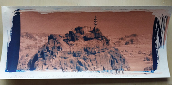
So I've been doing some more testing, and so far, this is the best I can come up with:
View attachment 394871
A couple of caveats:
* Trying to match the real-world colors of the print on a monitor is one thing, then getting f*ing FireFox to also get the basics of color management is quite another. So no guarantees that you're seeing what I'm seeing.
* This print is very fresh and in its basis (at least the shadows) it's a cyanotype. So in a few days, I expect the shadow areas will have deepened and become more saturated.
Still, it's a major leap forward compared to where I left off last night. Here are the main things I changed on my end:
* Switched to another batch of FAC. This improved matters dramatically. I now was left mostly with significant fog in the copper image.
* To combat the fog, I dropped the ammonium chloride from the sensitizer, and instead added 100mg/ml sodium chloride to the developer. This seems to clear things up fairly well. I've not experimented with different ratios.
I should also note that I'm currently using the developer concentrate at ca. 1+1 instead of 1+4 as it says on the tin. I don't know if that makes much of a difference.
Also, I think it makes sense to keep development times as short as possible. I just did a test with 10 minutes instead of the 4 minutes the print above received. Print-wise, the main difference is that the 10-minute print shows a bit more fog. It's not 'developed more' or anything. The colors are the same, the transition from cyano to cupro is at about the same step.
I also noticed no benefit to acid-soaking my papers. The print above was 'virgin' paper. I did some 'acid-tests' and they basically didn't make much of a difference. What improvement I did see on one paper, I could easily match by adding NaCl to the developer and foregoing the ammonium chloride.
The paper
@Cor used for his example and that I've also tested quite a bit with, Schut Simili Japon, fogs pretty badly. I've not been able to fix it. I've done most of my testing so far with Schut Salland, which seems to perform quite well. I just took a print from the wash made on a cheap Canson drawing paper and that also looks really well; maybe a little less saturated than the Salland print shown above, but also reasonably clean highlights.
Much of the fog seems to be suppressed by a combination of paper choice, adding sodium chloride to the developer and foregoing any ammonium chloride. IDK how important the latter is, but ammonium chloride tends to give me bad vibes when it comes to fog, although admittedly this is based mostly on my experience using it in silver gelatin lith printing - so quite a different application. Still, that ammonium ion is a bit of a rascal; better watch that guy closely. What fog remains, seems to be isolated along the edges of the area the developer was brushed on. So by brushing a little wider than the actual image area, most of the fog looks to be kept out of the image.
What I still haven't figured out is why the color palette that
@Cor and I are getting is so different from
@Raghu Kuvempunagar 's examples. Raghu's look so incredibly nice! The prints I've made so far are kind of...brutal. Very saturated, very in-your-face. It'd be nice to be able to tone this down a little. Maybe literally 'tone' it down? It's a new world - lots of parameters to play with.
Anyway...looks like something's starting to come together. I hope my notes above help fixing or avoiding problems for those who also want to give this a try. Sadly, I haven't the faintest idea what the difference between my two bottles of FAC is. One works, the other doesn't. That's about as much as I can sum up for now.