It's just words, words, words: Describing and interpreting film performance.

totocalcio

A
totocalcio

  • 4
  • 0
  • 65
Untitled

A
Untitled

  • 6
  • 2
  • 125
Jerome Leaves

H
Jerome Leaves

  • 3
  • 0
  • 74
Jerome

H
Jerome

  • 2
  • 0
  • 78
Sedona Tree

H
Sedona Tree

  • 1
  • 0
  • 85

Recent Classifieds

Forum statistics

Threads
197,446
Messages
2,759,106
Members
99,501
Latest member
Opa65
Recent bookmarks
0
OP
OP
aparat

aparat

Member
Joined
Sep 5, 2007
Messages
1,177
Location
Saint Paul,
Format
35mm
Any correlation between negative densities and Zones will be dependent on the photographic paper one is using.

Yes. This is the detail that, unfortunately, sometimes people leave out. I remember hearing a well-known photographer and educator giving a very definitive advice that "the perfect highlights are at 1.19" or something along those lines. Even if it was just an innocent omission, some people, especially those new to the ZS and sensitometry, may take such statements as gospel.
 
Joined
Jan 7, 2005
Messages
2,603
Location
Los Angeles
Format
4x5 Format
1. There are no direct correlation between a specific density and a Zone.
2. The negative density range that Adams proposes results from a misinterpretation of the test results. Zone I to Zone VIII is 7 stops. Adam writes the negative density range should be approximately 1.25. That makes for an average gradient of 0.59. Kodak uses a CI of 0.58 for their normal, but their aim NDR is 1.05 to fit on a grade two paper printed on a diffusion enlarger. Traditional LER range for a grade 2 is 0.95 - 1.14. If Adams' numbers are correct, the negative would fit on a grade 1, not a grade 2. But as the Zone System gradient is the same as Kodak's, they must be producing the same results. So it can't be both 1.25 and 1.05. One has to be a misinterpretation of the testing results.

The answer is that testing is done in a no flare environment. This includes Zone System based on how it shoots a single toned target that fall half way up the curve. As normal flare reduces the apparent subject luminance range by one stop, the film doesn't see a seven stop range, but a 6 stop range. To properly interpret the test results, the range to measure needs to be six stops and not seven.


In the two examples below, the top two quad represent a no flare scenario. With a full range subject, it would be impossible to achieve, but it represents the results obtained when contacting a step tablet. The bottom test uses the exact same film and processing, but the camera image has one stop of flare which effectively reduces the negative density range and is representative of actual shooting conditions. In effect, those who do Zone System testing get the values from the top from the testing, but actually obtain the values from the second example when shooting. The subject, negative, and the processing of the negative are identical in both examples. The only difference is factoring in flare.
1676612523154.png


The next example is how most people tend to measure exposure range on a curve. The two systems use slightly different Luminance ranges, tone reproduction uses 2.20 and Zone uses 2.10. Two different ways to illustrate the differences between interpreting the results with and without factoring in flare.

1676612904513.png
1676618143154.png


And a three quad example with no flare conditions. I've included the guideline numbers. The negative doesn't fit on a grade two paper. It's too contrasty. The tone reproduction diagram is an effective way to illustrate the relationships between the different aspects of the photographic process.
1676613501128.png


The same conditions but factoring in flare. The negative and print match.

1676617538654.png
 
Last edited:
OP
OP
aparat

aparat

Member
Joined
Sep 5, 2007
Messages
1,177
Location
Saint Paul,
Format
35mm
@Stephen Benskin Thank you for your detailed and highly informative demo. I agree that it can be demonstrated that there the strict mapping of zones into negative densities is tentative, at best, and yet, this claim has been repeated over and over in various print and online publications. I guess it's like one of those photography adages that get repeated so much that they take on a life of their own and become truths. Well, maybe I am being a bit harsh here, but this kind of story can lead photographers to a lot of wasted film and paper. I know I've been there. More than once.
 
OP
OP
aparat

aparat

Member
Joined
Sep 5, 2007
Messages
1,177
Location
Saint Paul,
Format
35mm
One other aspect of film performance photographers like to talk about is perceived sharpness and acutance. To do a proper quantitative analysis of sharpness and acutance, one would need very expensive instrumentation. What we can do, instead, is use words and pictorial examples to talk about sharpness.

What types of films, developers, and techniques have you guys seen to produce the most pronounced or pleasing sharpness and acutance effects?

The most comprehensive photography-focused (as opposed to sensitometry-focused) book on sharpness I can think of is Barry Thornton's Edge of Darkness (Amphoto Books, 2001), which I already mentioned in this thread. He devotes a considerable part of his book to describing various techniques that are meant to help photographers achieve the sharpest-looking prints possible. He says:

"There is a way to make acutance look even greater by use of enhanced edge effects. Metol has an especially useful characteristic to help this. When used in dilute form, at the edges of varying tone, it creates adjacency effects and sometimes forms what are known as Mackie lines." (p. 89)

Later, he goes on to add:
"The effect is particularly marked when the developer doesn't use a potassium bromide restrainer. It is a fact that P-Amidophenol developers like Rodinal are good at producing edge effects, but their grain is particularly pronounced." (p. 90)

His pursuit of sharpness and acutance had lead him to formulate his own developers, some of which are still in use today. I have also noticed some of these types of effects in my work, as I am sure a lot of you have, as well. The most pronounced effect I have ever come across has been in Pyrocat HD 1+1+200 using semi-stand agitation. The films most prone to this effect, I found, are Fujifilm Neopan 400, KODAK TRI-X 400, and KODAK T-MAX 400. I am sure other films would also produce this effect, but I haven't tested them.

Here's a recent photograph I took on TMY-2, processed in Pyrocat HD 1+1+200 for sixty minutes using semi-stand agitation (2 minutes continuous, followed by 30 minutes stand, 2 inversions at the half-point, followed by 30 minutes stand, using water stop bath, and Formulary TF-4 fixer). Pyrocat HD does include potassium bromide. I am not a chemist, and I wouldn't dare dispute Thornton's account.

I digitized the negative with my phone, inverted in Vuescan, with default settings for a generic negative, with no unsharp masking applied. I am not sure I like the effect, but there's no denying the fact that it does impart a particular character or mood, doesn't it?

TMY-2_400_PyrocatHD_60_semi-stand by Nick Mazur, on Flickr
 
Last edited:

Chuck1

Member
Joined
Jul 4, 2022
Messages
586
Location
Arlington ma
Format
Multi Format
I like the image, I got something like that once by overdeveloping the film (by accident)
and printing with a multigrade 5(the most contrasty one) filter by trial and error it suited the scene urban decay on a hot day.
I used to look at curves and think I understood them, Usually there is info on the range of film in stops(Is that Gamma? I'd call it Delta (difference in angle in geometry or trig)
I used a spot meter for the high and lows to quantatatively (sp) see the range in brightness, take the average in my head, then meter off what I wanted to be middle gray. and maybe diverge from the middle gray to obtain shadow detail (for roll film) by pushing the film at most 1/2 a stop.
I used rodinal (very diluted=least expense) and APX25 (@25) and apx100 (@80), and would be willing to change the development time by up to 1/2 a stop which was +- 5 min with very dilute developer(this was casual and while not precise it was consistent) . I would shoot a frame of a gray card half lit half shaded and look at that with the densitometer at school and compare it to a reference neg that was easy to print just to see if overall I should be developing longer or shorter. I had a notebook (wish I didn't lose it in a move)
I had used sprint chemicals and got muddy low contrast negs, didn't like tmax and that developer, some people swore by it. trix and plus x were ok.
once I found agfa I never looked back, I had good luck with it, it was consistent. I thought I knew what I was doing, I even had a table for pinhole times(which was reliable-I eventually had that down to a science with a sekonic L158)
i still made mistakes as the light changes during a 45 minute exposure.

I think I am reiterating something siruis glass said in 4 or 5 words

the ansel adams quote cited several times previously to me says don't let the technical aspects of photography dominate the creative process, it's a balance of both, ultimately it is about the print, and the easiest way to get a good print is with a good negative.
 
Joined
Jan 7, 2005
Messages
2,603
Location
Los Angeles
Format
4x5 Format
In Adams’ The Print, Introduction, “I have found that many students read descriptions of a procedure in a rather strict way, and are then consumed with the effort to produce exact relationships between subject luminance values, negative densities, and print values.” Could this be partially due to the Dunning-Kruger effect with Adams being the primary or only source for many, and many of the other sources just being a rehashing of Adams? Lacking a broader understanding, Adams is regarded as the defacto authoritarian source. Then there are the apologists who rationalize any claims not supported in tone reproduction theory. They generally claim that Adams really understood the process and simplified it for the average photographer or in some cases the apologist will interpret and twist a concept in order to shoehorn it into accepted tone reproduction theory. This also occurs due to vagaries in Adams’ writings.

My contention is that Adams failed in his explanation of a couple of fundamental concepts which resulted in confusion for many photographers’ decades after this death. Confusion that really shouldn’t exist as the information is readily available. One concept is, of course, personalized film speed, which I’ve talked about. The other is matching the scene log subject luminance range to the negative density range and matching the negative density range to the paper log exposure range.

In The Negative, Adams has the aim densities for a diffusion enlarger as:

Value I: 0.09 – 0.11
Value V: 0.65 – 0.75
Value VIII: 1.25 – 1.35

NDR 1.15 - 1.25

Based on the stated parameters the range of average gradient for a normal negative would be 0.55 to 0.59 which is considered the average gradient range for a normal negative. The disconnect from tone reproduction theory is the aim density range given by Adams is larger than that used by tone reproduction. Since the average gradient range utilized by the two systems is identical, it follows that it would produce the same negative density range under the same shooting conditions. Why the difference? In a word, flare.

Was Adams aware of this? No. He believed flare was part of the testing process and the testing reflected actual shooting conditions. In The Negative, Appendix 2, Film Test Data, there are a number of film curves which confirms the aim density range values are based on no flare conditions.

1678520568090.png


This example shows two functions of a characteristic curve. One is to display the data. This is a graphic representation of how a film responds to sensitometric exposure and development. The other is interpreting how the film curve responds to photographic exposure. This is done by superimposing camera exposure information over the graphed curve. Input is along the x-axis. As we know, the camera image doesn’t have a one to one relationship to the original scene. The camera’s optical system introduces flare which compresses the shadows. This would be reflected in smaller intervals in the shadow portion of the input camera exposure. The example from The Negative has equally spaced intervals which suggests flare wasn’t factored in. If it was, the camera exposure for a normal seven stop range would only amount to six stops of the sensitometric exposure on the film curve. One stop of the subject luminance range is lost to flare.

As the example isn’t incorporating flare into the interpretation, it’s conclusion of the negative density range resulting from a scene with a seven stop luminance range is incorrect. It’s too large. This is a common mistake. To correctly interpret a seven stop luminance range on a sensitometrically exposed film curve, you are effectively working with six stops, or Δ1.80 log-H, or 0.30 to the left of where Adam’s is indicating Zone VIII’s placement. Once you’re aware of this, it becomes apparent and like the frequency illusion, you will begin to see it everywhere. In the paper ISOR. In Kodak’s CI listing with their film development charts. And in cool diagrams in film catalogs, like the following from Kodak’s Publication G-1, Quality Enlarging with Kodak B&W Papers.

1678516303034.png


Two caveats to begin with, the intervals don’t apparently represent one stop steps and the diagram uses a 7 1/3 stop luminance range, which is statistically average. The 1/3 stop difference isn’t critical in practice, but it helps with the math coming out cleaner.

What should quickly become apparent is how the Subject’s log subject luminance range of 2.20 becomes a log luminance range of 1.90 in the Optical Image. The note along the right side indicates this caused by a “Moderate Flare Level Lens.” If this step is missed, then the range used on the film curve is off and the results will be off. The interpretation is flawed and doesn’t represent reality.

The negative developed to a CI of 0.56 has a density range of 1.05. It is printed on a Grade 2 glossy paper. 1.05 / (2.20 – 0.30) = 0.553 (Zone: 1.05 / (2.10 – 0.30) = 0.58). Grade 2 for a diffusion enlarge has an LER from 0.95 – 1.15 with 1.05 in the middle of the range. It’s all spelled out including how the negative relates to the print, which Adams never specified.

Yet, the Zone System aim value for a normal negative density range persists even in the face of its inaccuracy.
 
Last edited:
OP
OP
aparat

aparat

Member
Joined
Sep 5, 2007
Messages
1,177
Location
Saint Paul,
Format
35mm
@Stephen Benskin Thank you for yet another fantastic demo. I have wondered myself what motivated Adams and others to leave out camera flare entirely from the Zone System and other B&W paradigms. Speaking of subsequent sources rehashing Adams, this pictures sums it up pretty well. He was larger than life, at least among photographers.

Ansel Adams by Nick Mazur, on Flickr

I think it would have been known not just to Adams but, more importantly, to his editors and reviewers, that camera flare was an integral part of the tone reproduction cycle. And yet, Adams left it out. Phil Davis and Lambrecht and Woodhouse also, for the most part, left it out. Yes, in the BTZS textbook, there's a detailed section on flare, but flare is absent from most of the System, otherwise. In the Way Beyond Monochrome, flare is mentioned a few times, and the famous Kodak nomograph was printed on p. 140 to help with the flare-corrected CI compensation, along with the conclusion that "I have not found any need to do so with any of my equipment."

I ask myself if I were to write a photography textbook today (ain't never going to happen), would I include flare? I would probably try, but I wouldn't be surprised if my editor persuaded me to take it out. The Zone System offers such a simple, and potentially powerful, mapping of subject luminances to print values that the inclusion of any confounding factors, such as flare, would have weaken the Zone System's appeal to the average amateur photographer. Perhaps flare is destined to be a topic for film geeks like a lot of us here on the forum? I hope not because demos like yours can really help us understand how to create better photographs.

By the way, I finally tested the new Ilford MGV RC paper and ran a simple tone reproduction analysis with TMY-2. I made a print last night using the data from this plot and it worked out well, at least from the technical point of view.

Could you please take a look at tell me if I got anything wrong here? I'd really appreciate it. I am making my way through the code I wrote a while back, and still have some catching up to do. I guess I should have kept better notes.

tmy2_ilfordMGVRC by Nick Mazur, on Flickr
 

relistan

Member
Joined
Sep 1, 2013
Messages
1,533
Location
Dublin, Ireland
Format
Multi Format
What types of films, developers, and techniques have you guys seen to produce the most pronounced or pleasing sharpness and acutance effects?
One way to get high acutance from a developer is for it to exhaust during the development process. There are other ways, but this is the one I most commonly see. You can get this from dilute developers, like Rodinal, and can also create this exhaustion effect with either a water bath at the end of any normal developer (different dev times), or using a two bath developer. I found that my 2B-1 two bath developer produces quite high acutance and sometimes strong Mackie lines:

Here's an example on ADOX Silvermax:


If you look at the power line that appears white in the air in the middle of the frame, it has lines on both sides.
 

Bill Burk

Subscriber
Joined
Feb 9, 2010
Messages
9,156
Format
4x5 Format
That’s great Stephen!

In the hourglass-like graphic representation the intervals begin with 0.2 log subject luminance range but the absolute intervals are compressed and expanded according to the negative and print curves curves that are applied by the different stages of flare, negative and print.

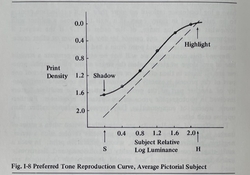
aparat your four quadrant graphic representation looks correct. In the upper-right quadrant you “could” include the “preferred” tone reproduction curve as a guide (we aren’t aiming for 1:1) (see fig I-8 from Todd Zakia). Stephen, is it more correct to label the lower-right quadrant x-axis as Log Subject Luminance?
 

Attachments

  • 9B64C7E2-E1B6-4B13-BBC5-740B85CF80CD.jpeg
    9B64C7E2-E1B6-4B13-BBC5-740B85CF80CD.jpeg
    63.1 KB · Views: 46
OP
OP
aparat

aparat

Member
Joined
Sep 5, 2007
Messages
1,177
Location
Saint Paul,
Format
35mm
One way to get high acutance from a developer is for it to exhaust during the development process. There are other ways, but this is the one I most commonly see. You can get this from dilute developers, like Rodinal, and can also create this exhaustion effect with either a water bath at the end of any normal developer (different dev times), or using a two bath developer. I found that my 2B-1 two bath developer produces quite high acutance and sometimes strong Mackie lines:

Here's an example on ADOX Silvermax:


If you look at the power line that appears white in the air in the middle of the frame, it has lines on both sides.


That's a great example! Thank you for posting it. I still have some of the Barry Thornton Two-Bath developer left. I will try it next time to see if I can get some extra acutance with it.

The greatest amount of acutance I've come across is from Pyrocat HD in a semi-stand process. It can look like an over-sharpened digital image.

Here are two prints I made the other night. Both shot wide-open, both in deep shade, with the sun behind them, both at EI800. The first one is on HP5 Plus, processed in XTOL-R for 16 minutes, the second on TMY-2, processed in Pyrocat HD 1+1+200 for 40 minutes, semi-stand. Both printed on Ilford MGV RC paper. The first print has subtle sharpness, which works great in a female portrait, with gentle tonality, the second has overly pronounced sharpness, where every crease in the jacket and face is exaggerated. I am not sure I like this kind of look, but it gives the photograph a bit of a grungy character. The prints were scanned with VueScan with sharpness off.

Texting by Nick Mazur, on Flickr

In front of a convenience store by Nick Mazur, on Flickr


@Bill Burk Thank you for the feedback! That's a great idea. The 45-degree straight line is an unrealistic reference for pictorial photography, I agree. The ideal curve, as they define it, would have a straight line in the mid-tones, with some amount of compression in the shadows and highlights (presumably resulting from both camera (shadows) and enlarger (highlights) lens flare) . They offer a general description of such a curve on p. 94. I should probably give it a try.
 
Joined
Jan 7, 2005
Messages
2,603
Location
Los Angeles
Format
4x5 Format
That’s great Stephen!

In the hourglass-like graphic representation the intervals begin with 0.2 log subject luminance range but the absolute intervals are compressed and expanded according to the negative and print curves curves that are applied by the different stages of flare, negative and print.

aparat your four quadrant graphic representation looks correct. In the upper-right quadrant you “could” include the “preferred” tone reproduction curve as a guide (we aren’t aiming for 1:1) (see fig I-8 from Todd Zakia). Stephen, is it more correct to label the lower-right quadrant x-axis as Log Subject Luminance?

While considerate to users, I have to disagree. Where else do you have to have an example of an ideal "goal?" People who utilize curves should have a basic understanding on how to interpret them. Thus the reason for the curve interpretation thread I started. The problem is too often people learn how to create a curve and then stop before learning how to correctly use it. They also tend to limit themselves to just the film curve when it's only part of the process. Besides, there are only a few aims to consider with the reproduction curve. The mid-tone gradient needs to be over 1.08 and the reproduction curve should be about 1/3 stop below (lighter) than the reference curve. The gradient steps give the specifics and we can evaluate whether a section will tend to look on the dark or light side depending on it's distance from the reference.
 
Last edited:
Joined
Jan 7, 2005
Messages
2,603
Location
Los Angeles
Format
4x5 Format
It’s amazing how everything falls into place and so many questions are answered when flare is factored in. Until we are forced by need or until we are faced with an obstacle, we're not required to address any specifics. Most of the general level photography books only give the concept of flare lip service. I don’t think it’s due to any decision to simplify the process. It’s because unless the author is plugging everything into an equation and the answer isn’t coming out exactly as predicted, they don’t need more than a hazy understanding. It’s like the Far Side comic that had the steps of an equation on a chalk board and one of the steps read “and then a miracle occurred.”

How many of photo books deal with exposure beyond setting f-Stops and shutter speeds, and maybe a nod to Evs? They might addressing it at a 35,000 foot level, but it’s certainly not as granular as it could be. I used to joke about the technical articles in View Camera Magazine. All the articles tended to drill down on their topic to a certain degree at which point they hit a technical wall and would start talking in photography as music metaphors. The authors aren't keeping anything from us for our own good, they simply don't understand the subject very well. Adams writes, "The tests that follow have been designed to account for the variables that exist n each person's working system - shutter and aperture, meter, lens, flare, and procedures of development." Then there's no proof it does. Just a vague ascertain from an authority figure (cue the Moses image).

How do you get an average log subject luminance range of 2.20, developed to what is considered normal development of 0.56 – 0.58, to print on a grade two paper with an LER of 1.05 using a diffusion enlarger? If you’re just out shooting, it doesn’t really matter, but if you are writing a program or book, or teaching a higher level class, or just working it out on paper for yourself, you have to understand how the actual process works or you're stuck. Or maybe a miracle occurs and it sounds like a symphony.
 
Last edited:
Joined
Jan 7, 2005
Messages
2,603
Location
Los Angeles
Format
4x5 Format
@aparat, the four quad looks good. It's clean, readable, and everything lines up. I only have a couple of suggestions. It appears you are including film base + fog with the film curve. You might want to add a Fb+f value in the film info. It will help with the evaluation. In the camera quadrant, you have 1.3 as the flare factor. I'm assuming flare is 1 1/3 stops. I'm really bad at defining math terms so forgive me if I don't explain it correctly. Flare factor is a geometric progression with a base 2. You can include both expressions for the sake of clarity. Finally, you might want to keep the number of decimal points consistent in the reproduction curve's gradient values to maintain a clean alignment. Do you include options on displaying certain values or calculations. For example, is the luminance range and exposure adjustable? Here are some of the options I use with mine.

1678655851999.png
 
Last edited:

relistan

Member
Joined
Sep 1, 2013
Messages
1,533
Location
Dublin, Ireland
Format
Multi Format
The greatest amount of acutance I've come across is from Pyrocat HD in a semi-stand process. It can look like an over-sharpened digital image.
Yes! Low agitation regimes also allow exhaustion to occur. Combining these techniques is one of the reasons semi stand Rodinal 1+100 can produce strong edge effects.

Here are two prints I made the other night.

These are great photos. I am not great with people shots and appreciate your excellent portraits all the more for it.
 

snusmumriken

Subscriber
Joined
Jul 22, 2021
Messages
2,348
Location
Salisbury, UK
Format
35mm
That's a great example! Thank you for posting it. I still have some of the Barry Thornton Two-Bath developer left. I will try it next time to see if I can get some extra acutance with it.

The greatest amount of acutance I've come across is from Pyrocat HD in a semi-stand process. It can look like an over-sharpened digital image.

Here are two prints I made the other night. Both shot wide-open, both in deep shade, with the sun behind them, both at EI800. The first one is on HP5 Plus, processed in XTOL-R for 16 minutes, the second on TMY-2, processed in Pyrocat HD 1+1+200 for 40 minutes, semi-stand. Both printed on Ilford MGV RC paper. The first print has subtle sharpness, which works great in a female portrait, with gentle tonality, the second has overly pronounced sharpness, where every crease in the jacket and face is exaggerated. I am not sure I like this kind of look, but it gives the photograph a bit of a grungy character. The prints were scanned with VueScan with sharpness off.

Texting by Nick Mazur, on Flickr

In front of a convenience store by Nick Mazur, on Flickr


@Bill Burk Thank you for the feedback! That's a great idea. The 45-degree straight line is an unrealistic reference for pictorial photography, I agree. The ideal curve, as they define it, would have a straight line in the mid-tones, with some amount of compression in the shadows and highlights (presumably resulting from both camera (shadows) and enlarger (highlights) lens flare) . They offer a general description of such a curve on p. 94. I should probably give it a try.

I agree with your verdict on both shots. The first one is lovely, the second one spoiled by those dark crevices and very black background shadows. It’s exactly the look that turned me off Kodak T-grain films. But can you convince me that is an acutance effect, rather than tones falling on a very short toe?
 

Sirius Glass

Subscriber
Joined
Jan 18, 2007
Messages
50,119
Location
Southern California
Format
Multi Format
I agree with your verdict on both shots. The first one is lovely, the second one spoiled by those dark crevices and very black background shadows. It’s exactly the look that turned me off Kodak T-grain films. But can you convince me that is an acutance effect, rather than tones falling on a very short toe?

I disagree. The dark areas of the second photograph add to the composition, not distract. The depths of shadows are not always meant to be seen.
 
OP
OP
aparat

aparat

Member
Joined
Sep 5, 2007
Messages
1,177
Location
Saint Paul,
Format
35mm
@aparat, the four quad looks good. It's clean, readable, and everything lines up. I only have a couple of suggestions. It appears you are including film base + fog with the film curve. You might want to add a Fb+f value in the film info. It will help with the evaluation. In the camera quadrant, you have 1.3 as the flare factor. I'm assuming flare is 1 1/3 stops. I'm really bad at defining math terms so forgive me if I don't explain it correctly. Flare factor is a geometric progression with a base 2. You can include both expressions for the sake of clarity. Finally, you might want to keep the number of decimal points consistent in the reproduction curve's gradient values to maintain a clean alignment. Do you could include options on displaying certain values or calculations. For example, is the luminance range and exposure adjustable? Here are some of the options I use with mine.

Thank you so much for taking the time to review this and for your comments and suggestions! I referenced your work when I wrote this, so thank you for that, too.

Yes, it is 1.3 stops of flare, and I will include a more clear info window for that. Yes, I wrote this such that luminance, exposure, alignment, and other variables can be adjustable. Once I am finished working through my existing code, I am planning to add a feature to generate different film and paper curves to make demos, like those you frequently post. I think there's great potential educational value in that. Currently, I can only work with actual film and paper data.
 
OP
OP
aparat

aparat

Member
Joined
Sep 5, 2007
Messages
1,177
Location
Saint Paul,
Format
35mm
I agree with your verdict on both shots. The first one is lovely, the second one spoiled by those dark crevices and very black background shadows. It’s exactly the look that turned me off Kodak T-grain films. But can you convince me that is an acutance effect, rather than tones falling on a very short toe?

Thank you. I guess maybe we can meet half-way on this and agree that some of what I call "grungy" look is due to the film curve and some due to the acutance. I meant the creases in the person's face and clothing. If I made a female portrait like that, I'd probably get a negative response from the subject. On the other hand, I've seen those wet plate 8x10 portraits where you can see every freckle, wrinkle, and blemish, even those underneath the skin, so I guess maybe it's a look that at least some people enjoy.
 
OP
OP
aparat

aparat

Member
Joined
Sep 5, 2007
Messages
1,177
Location
Saint Paul,
Format
35mm
@relistan Thanks! Speaking of acutance, can your PC-512 Borax developer be diluted, say 1+100 or 1+200? If so, how would Solution B work then in terms of dilution? I am finishing a roll of Kentmere 100 and I am planning to use your developer with it.
 

relistan

Member
Joined
Sep 1, 2013
Messages
1,533
Location
Dublin, Ireland
Format
Multi Format
@relistan Thanks! Speaking of acutance, can your PC-512 Borax developer be diluted, say 1+100 or 1+200? If so, how would Solution B work then in terms of dilution? I am finishing a roll of Kentmere 100 and I am planning to use your developer with it.

I have not tested it more diluted but @Andrew O'Neill did at 1+100 semi-stand. He found that fog was higher like that and added a small amount of benzotriazole to counter it. He liked it that way. As far as I know that is the only test at a dilution other than 1+50. My guess is graininess will be higher but don’t know if dilution will cause enough exhaustion to influence edge effects. Ascorbic acid in even the tiniest amounts will readily regenerate phenidone.
 
Joined
Jan 7, 2005
Messages
2,603
Location
Los Angeles
Format
4x5 Format
In the Way Beyond Monochrome, flare is mentioned a few times, and the famous Kodak nomograph was printed on p. 140 to help with the flare-corrected CI compensation, along with the conclusion that "I have not found any need to do so with any of my equipment."

I believe that's because it's already factored into his developmental model. It's the same tweak that Adams basically does. The development model in WBM is shown on page 128 fig 2. It appears to use a LER / NDR of 1.20.

1678774192213.png


Interestingly, these numbers are very close to the ones I've obtained using my practical flare model. Flare reduces the effective luminance, but if you don't use flare to reduce the luminance range variable, then you need to increase the LER / DR variable to compensate. A constant if you will. Working backwards from a normal negative of 0.58, each stop of the luminance range would average 0.30 * 0.58 = slightly over 0.17 units of density per stop of luminance. To keep it simple, a 7 stop luminance range would result in a negative density range of 7 * 0.17 = 1.19. Approximately what WBM uses. As we know in reality, average flare reduces the seven stop luminance range to six stops so the resulting negative density range should be more like 6 * 0.17 = 1.02.

On page 62 fig. 6, WBM has grade 2 as ranging from 0.95 to 1.15 with the average as 1.05. 1.20 falls outside the range of a grade 2 paper. For the math to work when determining a CI, you need to add an extra 0.15 density range to the grade 2 aim density range of 1.05 in the equation or subtract flare from the luminance range. The end result is the same. Only one reflects reality.
 

Andrew O'Neill

Moderator
Moderator
Joined
Jan 16, 2004
Messages
11,761
Location
Coquitlam,BC Canada
Format
Multi Format
I have not tested it more diluted but @Andrew O'Neill did at 1+100 semi-stand. He found that fog was higher like that and added a small amount of benzotriazole to counter it. He liked it that way. As far as I know that is the only test at a dilution other than 1+50. My guess is graininess will be higher but don’t know if dilution will cause enough exhaustion to influence edge effects. Ascorbic acid in even the tiniest amounts will readily regenerate phenidone.

Grain was pretty consistent between the benzo added and non-benzo negatives (1+100). With 1+100 semi-stand benzo added, the negative showed ever so slightly more grain. It got really nasty though at a dilution of 1+200 (semi-stand). This was with CatLABS 80 II. I still need to test it with HP5, FP4, Rollei IR... 🙂
 

Andrew O'Neill

Moderator
Moderator
Joined
Jan 16, 2004
Messages
11,761
Location
Coquitlam,BC Canada
Format
Multi Format
One other aspect of film performance photographers like to talk about is perceived sharpness and acutance. To do a proper quantitative analysis of sharpness and acutance, one would need very expensive instrumentation. What we can do, instead, is use words and pictorial examples to talk about sharpness.

What types of films, developers, and techniques have you guys seen to produce the most pronounced or pleasing sharpness and acutance effects?

The most comprehensive photography-focused (as opposed to sensitometry-focused) book on sharpness I can think of is Barry Thornton's Edge of Darkness (Amphoto Books, 2001), which I already mentioned in this thread. He devotes a considerable part of his book to describing various techniques that are meant to help photographers achieve the sharpest-looking prints possible. He says:

"There is a way to make acutance look even greater by use of enhanced edge effects. Metol has an especially useful characteristic to help this. When used in dilute form, at the edges of varying tone, it creates adjacency effects and sometimes forms what are known as Mackie lines." (p. 89)

Later, he goes on to add:
"The effect is particularly marked when the developer doesn't use a potassium bromide restrainer. It is a fact that P-Amidophenol developers like Rodinal are good at producing edge effects, but their grain is particularly pronounced." (p. 90)

His pursuit of sharpness and acutance had lead him to formulate his own developers, some of which are still in use today. I have also noticed some of these types of effects in my work, as I am sure a lot of you have, as well. The most pronounced effect I have ever come across has been in Pyrocat HD 1+1+200 using semi-stand agitation. The films most prone to this effect, I found, are Fujifilm Neopan 400, KODAK TRI-X 400, and KODAK T-MAX 400. I am sure other films would also produce this effect, but I haven't tested them.

Here's a recent photograph I took on TMY-2, processed in Pyrocat HD 1+1+200 for sixty minutes using semi-stand agitation (2 minutes continuous, followed by 30 minutes stand, 2 inversions at the half-point, followed by 30 minutes stand, using water stop bath, and Formulary TF-4 fixer). Pyrocat HD does include potassium bromide. I am not a chemist, and I wouldn't dare dispute Thornton's account.

I digitized the negative with my phone, inverted in Vuescan, with default settings for a generic negative, with no unsharp masking applied. I am not sure I like the effect, but there's no denying the fact that it does impart a particular character or mood, doesn't it?

TMY-2_400_PyrocatHD_60_semi-stand by Nick Mazur, on Flickr

Stand/semi-stand has been a controversial topic on this forum. I'll be uploading a video this weekend on the topic of semi-stand/full on stand development with Pyrocat-HD. I've been using this developer for 20 years, and occasionally employ this technique. I've never taken an in depth look into it until now. It was an eye opener for me and lets just say that I've made some changes as to how I approach it now. 🙂
 
OP
OP
aparat

aparat

Member
Joined
Sep 5, 2007
Messages
1,177
Location
Saint Paul,
Format
35mm
Stand/semi-stand has been a controversial topic on this forum. I'll be uploading a video this weekend on the topic of semi-stand/full on stand development with Pyrocat-HD. I've been using this developer for 20 years, and occasionally employ this technique. I've never taken an in depth look into it until now. It was an eye opener for me and lets just say that I've made some changes as to how I approach it now. 🙂

Andy, I get it. I think I have observed some of the forum dynamics, and, yes, semi-stand and stand are kind of controversial, esp. if you read some of the older threads. I find Pyrocat HD to give the most pronounced stand-like effect (e.g., highlight compression, adjacency effect, slight shadow detail improvement) of any developers I've tried, including Rodinal and HC-110. I also find that it's very good at giving even development in a semi-stand process, as long as I agitate for the first two minutes.

Having said that, it can be a double-edged sword. I know it's a stereotype, so forgive me, but, for female portraits, it's a bit much. For male portraits, it can bring out some texture in the face and clothing, giving a certain kind of look. Don't ask me to describe, I just know it when I see it :smile:.

I just printed this portrait the other night, taken on TMY-2, processed in Pyrocat HD 1+1+200 for 40 minutes (semi-stand), take at f/3.5 (wide open). I think it is an interesting look.

A street portrait is always an opportunity for a great conversation. by Nick Mazur, on Flickr
 
Photrio.com contains affiliate links to products. We may receive a commission for purchases made through these links.
To read our full affiliate disclosure statement please click Here.

PHOTRIO PARTNERS EQUALLY FUNDING OUR COMMUNITY:


Ilford ADOX Freestyle Photographic Stearman Press Weldon Color Lab Blue Moon Camera & Machine
Top Bottom