Showcase for Your HCWP's

totocalcio

A
totocalcio

  • 2
  • 0
  • 22
Untitled

A
Untitled

  • 2
  • 2
  • 66
Jerome Leaves

H
Jerome Leaves

  • 2
  • 0
  • 56
Jerome

H
Jerome

  • 2
  • 0
  • 57
Sedona Tree

H
Sedona Tree

  • 1
  • 0
  • 58

Forum statistics

Threads
197,432
Messages
2,758,907
Members
99,494
Latest member
hyking1983
Recent bookmarks
0

koraks

Moderator
Moderator
Joined
Nov 29, 2018
Messages
20,598
Location
Europe
Format
Multi Format
Sanders, I don't find it coy to post behind a spoiler tag (even though it took me a moment to realise which picture you were talking about and that I had to actually do something to see the image - total noob, I know)... To me it seems like a pretty acceptable and sensible compromise...

Having said that, I'd also like to ask from a moderator's perspective to discuss the question whether or not to post nudes elsewhere on the forum. Let's keep this thread dedicated to the actual prints.
 

Rolleiflexible

Subscriber
Joined
Mar 22, 2005
Messages
2,196
Location
Mars Hill, NC
Format
Multi Format
Having said that, I'd also like to ask from a moderator's perspective to discuss the question whether or not to post nudes elsewhere on the forum. Let's keep this thread dedicated to the actual prints.

It seems a fair use of the thread, to ask participants how they prefer to interact with it, and what they prefer to see in it. That seems on topic to me.

I agree the thread should not be hijacked into a discussion of censorship and NSWF content. I also don’t want to turn the thread into Sanders’s Nudes. This is a worthwhile space for sharing work. I love it that @Carnie Bob is posting his new work here, and I find @maverickaesthetics’s tricolor print yet another reason to dive into cyanotypes. I don’t want to kill it with a flood of my own print scans, especially if they offend some.

Seems to me you are thinking about it too much.

I often do. But I know this is an issue that matters deeply to some participants in this thread. Not bombasts: Peers whom I know you respect.

I’ll stop here — no need to belabor the point. I appreciate the feedback.
 

Rolleiflexible

Subscriber
Joined
Mar 22, 2005
Messages
2,196
Location
Mars Hill, NC
Format
Multi Format
A more general question to your goals with these images.

Jo, it’s a fair question and I don’t have a ready answer, yet. Twenty years ago, I started shooting a series of nude portraits. It was all about the eyes. Nudity was a thread but I worked hard to avoid erotic suggestions. I wanted to play on the incongruity of nude portraiture as a way of exploring what a portrait is, and how viewers process nudity out of the expected contexts.

This time, I want to revisit naked bodies in a less cerebral way, on a more inchoate level. Some, like the first image, are cropped and reworked negatives from the portrait series. Others, like the second, are newer images. Your question of how these work as gravures is a fair one. I am about to find out.
 
OP
OP

nmp

Member
Joined
Jan 20, 2005
Messages
1,995
Location
Maryland USA
Format
35mm
If you ask my opinion, I am fine with nudes on this thread or any other place in the forum for that matter as long as the owner of of the site does not object and the subject matter is legal. Of course, it does not hurt for the content to be in good taste which so far has been true of what has been shared here. Saunders is perhaps hesitant because I had mentioned my preference not to receive any nudes in the print exchange. But that is a different matter all together - it's just that I have no artistic appreciation for nudes and would rather own a landscape or nature, still life etc. in my personal collection, something I can also display in my home and share with others freely who, you never know, might not distinguish between pornography and nudes.

:Niranjan.
 

TheFlyingCamera

Membership Council
Advertiser
Joined
May 24, 2005
Messages
11,548
Location
Washington DC
Format
Multi Format
Having said that, I'd also like to ask from a moderator's perspective to discuss the question whether or not to post nudes elsewhere on the forum. Let's keep this thread dedicated to the actual prints.

It doesn't really need re-discussion here or elsewhere. It's been a long-standing policy that nudes are ok so long as they're not sexually explicit or depicting illegal content (minors, violence, etc).
 
Joined
Feb 7, 2024
Messages
27
Location
New Zealand
Format
Multi Format
So now I am not sure what to do. I am printing the photos now as kallitypes, as an easy way to proof them and decide which to keep and which need work. My ultimate plan is to print the series as photogravures. But in the meantime I have a lot of kallitypes in the hopper. And I have no easy avenue for testing the response to these prints.
A response to your technique, rather than the images themselves, if I may...

When I started printing in alt processes (initially exclusively in cyanotype), I usually deliberately coated an area slightly smaller than what the negative covered, so that there was no dark frame around the image. I liked the image to have organic (brush-stroke) borders, rather than straight lines. I don't remember when and why I stopped doing that. Seeing your images here, where you do the same thing, I feel strongly attracted to this technique again. It works extremely well with these images in my view. Thanks for the inspiration, I will try this again for some prints.
 
Joined
Feb 7, 2024
Messages
27
Location
New Zealand
Format
Multi Format
I'd suggest to start with duo-tone cyanotypes, @Rolleiflexible. Tri-colours are great if they work, but the madder root for the magenta layer stains fairly strongly and can be a source of frustration (at least to me it is). For duo-tones, all you need is the (classic) cyanotype chemistry you already have and a bleach (like sodium carbonate). You also need to only linearise two processes instead of three ;-)
For duo-tones, the choice of subject is very important, since you cannot create reddish warm tones. However, skin tones work to a degree, since the yellow is more an ochre than a pure yellow. But it's best to choose images that are almost exclusively made up of cyan and yellow.
When the image below appeared in the development of the cyan layer, I was quite taken aback. I didn't quite expect such a result at all. But I'm very pleased with how it came out.

Lake Pukaki - Duo-tone cyanotype

Lake Pukaki Duotone Cyanotype.jpeg
 
  • Carnie Bob
  • Deleted
  • Reason: rest of images to big
  • Carnie Bob
  • Deleted
  • Reason: On author's request
  • fgorga
  • Deleted
  • Reason: Response to deleted comment
OP
OP

nmp

Member
Joined
Jan 20, 2005
Messages
1,995
Location
Maryland USA
Format
35mm
Thanks Ned. I am like a blind squirrel. If I dig around enough, I eventually find something.

lesson from the blind squirrel (or any squirrel for that matter) dig around but don't dig in.

Agree with Ned. As far I can tell this is your first foray into salt. What paper and process did you utilize?

:Niranjan.
 
Joined
Jul 31, 2012
Messages
3,281
Format
35mm RF
lesson from the blind squirrel (or any squirrel for that matter) dig around but don't dig in.

Agree with Ned. As far I can tell this is your first foray into salt. What paper and process did you utilize?

:Niranjan.

Niranjan, I used the Bostick kit. Paper was Fabriano Studio HP watercolor. It fogs unfortunately with the Bostick salt, but the fog worked for that image. I just salted some paper last night with a NaCl/Citric Acid mix I think you use (2%/5%) and the first print is much cleaner on the same paper. I just got lucky since the fog worked with the above image. You are right that I am new to salt prints so I mostly get crap. I've had issues with splotchiness so I decided to salt the paper by immersion instead of brushing. Seems to work better so far. I think I am also going to use a puddle pusher instead of a brush for the silver coat. I just need to make one. I have a big one but I don't make big prints too often.

Here is the print above next to the one from last night. The Citric Acid made quite the difference. Although the second is technically better, I think the foggy print in this case works better.

IMG_1054.jpeg
 
OP
OP

nmp

Member
Joined
Jan 20, 2005
Messages
1,995
Location
Maryland USA
Format
35mm
Niranjan, I used the Bostick kit. Paper was Fabriano Studio HP watercolor. It fogs unfortunately with the Bostick salt, but the fog worked for that image. I just salted some paper last night with a NaCl/Citric Acid mix I think you use (2%/5%) and the first print is much cleaner on the same paper. I just got lucky since the fog worked with the above image. You are right that I am new to salt prints so I mostly get crap. I've had issues with splotchiness so I decided to salt the paper by immersion instead of brushing. Seems to work better so far. I think I am also going to use a puddle pusher instead of a brush for the silver coat. I just need to make one. I have a big one but I don't make big prints too often.

Here is the print above next to the one from last night. The Citric Acid made quite the difference. Although the second is technically better, I think the foggy print in this case works better.

View attachment 371934

That's a dramatic difference. I would rather have the process of the right side and fix the "look" in the negative. That way you will have highlights when you need it. Of course, this is true if you are using a digital negative. If you are using an analog one, it is nice to have several difference options for the process/materials for a desired outcome as demonstrated nicely here.

Happy digging!

:Niranjan.
 

NedL

Subscriber
Joined
Aug 23, 2012
Messages
3,367
Location
Sonoma County, California
Format
Multi Format
I'm happy to see those whites more preserved in the 2nd one. Thing is... one of the things I like best about salt prints are delicate almost glowing highlights... need to be able to get to white to see the delicate ones. ( I'm the opposite of most people here... and don't care as much about "dmax" if the highlights are in good shape ) Have fun!
 

Rolleiflexible

Subscriber
Joined
Mar 22, 2005
Messages
2,196
Location
Mars Hill, NC
Format
Multi Format
I went to last week's opening of The Nude show at the Southeast Center for Photography. There were over thirty works on display. One was a straight platinum print. Mine was a platinum kallitype. All of the other photographs were inkjet prints. Nothing, that I could see, was printed in silver gelatin.

While there, I saw other photographs of models I have shot over the years. It inspired me to go back and reinterpret a 2008 negative that I'd consigned to the outtake pile back then -- here's the kallitype printed this evening:

BrookeTorso.jpg
 
Joined
Feb 7, 2024
Messages
27
Location
New Zealand
Format
Multi Format
There were over thirty works on display. One was a straight platinum print. Mine was a platinum kallitype. All of the other photographs were inkjet prints. Nothing, that I could see, was printed in silver gelatin.

Not really surprising. I also had a print in one of their exhibition maybe two years ago. But I was very aware that the majority of the other submissions would be inkjet prints. I'm actually surprised that there was another platinum print there...
BTW, very nice print. Delicate gradients, which suit the subject well.
 
Last edited:
Joined
Feb 7, 2024
Messages
27
Location
New Zealand
Format
Multi Format
Here is the print above next to the one from last night. The Citric Acid made quite the difference. Although the second is technically better, I think the foggy print in this case works better.
Patrick, this has a lot to do with the paper you're using. Fabriano Artistico is a very heavily buffered paper which makes it unsuitable 'out-of-the-box' for most alt processes. But I'm also one who really likes the surface texture of this paper and I am printing a series in Mike Ware's New Cyanotype on this paper. However, I have to pre-treat it with a soak in sulfamic acid. That sorts it out very nicely.

As to your prints: when you posted your first version, I was very much attracted to the ethereal look of the image. The fogging and loss of contrast make it stand out - it genuinely looks like a 100-year old print. The version on the right might be a technically better print (and, to be honest, a print I personally would probably aim for despite my following remark), but the first one has much bigger impact on me. Despite or because of its flaws. The haziness, the softness - I love it.
 

tnp651

Subscriber
Joined
Jan 9, 2017
Messages
177
Location
St. Paul, Minnesota, USA
Format
4x5 Format
Okay, let me give this a whirl. Here's a kallitype, toned in platinum. I shared this with two other photographers. They gave diametrically opposite opinions. If you have thoughts, I would like to hear them.


I think it's lovely and tasteful. The cropping is good. I'd have liked a little more detail in the lower part.
 
Joined
Jul 31, 2012
Messages
3,281
Format
35mm RF
Patrick, this has a lot to do with the paper you're using. Fabriano Artistico is a very heavily buffered paper which makes it unsuitable 'out-of-the-box' for most alt processes. But I'm also one who really likes the surface texture of this paper and I am printing a series in Mike Ware's New Cyanotype on this paper. However, I have to pre-treat it with a soak in sulfamic acid. That sorts it out very nicely.

As to your prints: when you posted your first version, I was very much attracted to the ethereal look of the image. The fogging and loss of contrast make it stand out - it genuinely looks like a 100-year old print. The version on the right might be a technically better print (and, to be honest, a print I personally would probably aim for despite my following remark), but the first one has much bigger impact on me. Despite or because of its flaws. The haziness, the softness - I love it.

I was actually using Fabriano Studio which is a cheaper paper than Artistico. I have ways around acidifying paper when I do cyanotypes, but that depends on the paper. I am still just experimenting with Salt prints. I have only made a dozen or so. I am just using whatever paper I have laying around to try to use it all. Artistico is a great paper though. One of the best I've found.

Yeah, I got lucky with the first print, but I'll take it! Sometimes it is better to be lucky than good.
 

Rolleiflexible

Subscriber
Joined
Mar 22, 2005
Messages
2,196
Location
Mars Hill, NC
Format
Multi Format
I think it's lovely and tasteful. The cropping is good. I'd have liked a little more detail in the lower part.

Tom, thanks for the compliment. "Tasteful" is a minefield. Sometimes I worry that tasteful is a euphemism for anodyne. And the risk of giving offense in a broadband website (even in a narrower slice of it as here) leads me to choose prints that are least likely to give offense. But I know those are my issues, not yours, and I appreciate the compliment as you intended it.

Re the blocking up of detail at the bottom, it was intentional. I blocked up the highlights at the top of the frame, and wanted to balance that with blocked shadows at the bottom. I find myself blowing out and blocking up the areas that are not essential elements of the photo as I see it. So, in the high-key torso in Post 518, I blow out the highlights on the neck, shoulder and upper arm. I've already beheaded her -- I'm overexposing to distill her torso to its basic elements.
 
OP
OP

nmp

Member
Joined
Jan 20, 2005
Messages
1,995
Location
Maryland USA
Format
35mm
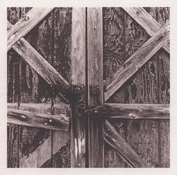
One more classic cyanotype toned with Sumac extract on Canson XL Watercolor 300 gsm paper:

Barn Door Toned Cyano.jpg

Barn Door. Frederick ,MD.

Thought the rust and faded paint would look better on a brown print.

Might be the last one for a while (hopefully not never) before I move to my new place and figure out how to set my work flow all over again.

:Niranjan.
 

koraks

Moderator
Moderator
Joined
Nov 29, 2018
Messages
20,598
Location
Europe
Format
Multi Format
That sumac toner works wonders, @nmp! It's lovely.
I wonder if it would work well with a tricolor-approach too? Chroma is a little low, it seems, but this may make for a nice and muted palette.

move to my new place and figure out how to set my work flow all over again.

Good luck! It always takes some time to get everything set up again, but it's also a great opportunity to make some improvements. In hindsight, I'm happy with the fact we moved a few years ago. My workspace is so much more practical and tidy now!
 
OP
OP

nmp

Member
Joined
Jan 20, 2005
Messages
1,995
Location
Maryland USA
Format
35mm
That sumac toner works wonders, @nmp! It's lovely.

Thanks! I added some contrast to the the original image that might have made the shadows a bit clumpy - I should probably back off a little. May be next time, whenever that is.

I wonder if it would work well with a tricolor-approach too? Chroma is a little low, it seems, but this may make for a nice and muted palette.

Interesting thought. May be @maverickaesthetics might have an opinion. For purer red, though, I would recommend cuprotype (without the acid toning.)

Good luck! It always takes some time to get everything set up again, but it's also a great opportunity to make some improvements. In hindsight, I'm happy with the fact we moved a few years ago. My workspace is so much more practical and tidy now!

Thanks, again. Yeah, I am hoping for the same. I will have more space for sure so I will be able to sprawl a bit.

:Niranjan.
 
Photrio.com contains affiliate links to products. We may receive a commission for purchases made through these links.
To read our full affiliate disclosure statement please click Here.

PHOTRIO PARTNERS EQUALLY FUNDING OUR COMMUNITY:


Ilford ADOX Freestyle Photographic Stearman Press Weldon Color Lab Blue Moon Camera & Machine
Top Bottom