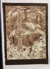
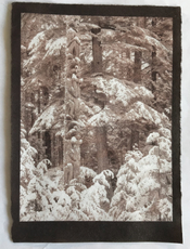
Been spending the last week crawling up the Argyrotype learning curve.
Is that anything like an old growth Douglas Fir?

Been spending the last week crawling up the Argyrotype learning curve.


More like climbing a Devils Club Spruce hybrid interspersed with fleeting moments of optimism.Is that anything like an old growth Douglas Fir?
Thanks.@MurrayMinchin
Congratulations! Not bad at all for a first print with a new process. Can't wait to see what you get after taming the highlights.
Would you provide more details on the paper you used and where you purchased it?


Thanks.
I got it here: https://paintspot.ca/art-supplies/p...arker/mulberry-paper-roll-wenzhou-paper-roll/
In the writeup it says paint doesn't spread or bleed, but sensitizer sure does so I've been tearing it to size and brushing right to the edges. Haven't decided on presentation yet, but leaning towards affixing to heavier European paper.
Beware though...blotches are occurring...you can see it in the discolouration on the bottom Beavers right 'arm'.
No I haven't. There are probably other Kozo papers better suited to ferric-silver sensitizers. I got this stuff intending to use it for polymer photogravures, but that plan is in limbo until I can get my hands on a second hand press.Murray,
...Have you tried this paper with any other alt process besides argyrotype?
Should work on any dry print, I imagine.@MurrayMinchin and @koraks ,
...Do you know if heating/ironing works on prints other than a 'fresh' print... i.e. does it work on prints that have already been dried, or on prints that have been re-wetted?
Thanks.
Got a bit impatient yesterday for an argyrotype to dry, so popped it into the oven compartment of our wood stove which was at about 110 degrees F, then forgot about it for 15 minutes resulting in quite the surprise. Had read Ware's account of heating prints for colour change, but wasn't prepared for the apparent increase in mid tone contrast and deeper resonant browns. Happy accidents
View attachment 381813 View attachment 381814

Thanks...maybe I'll add cinnamon to the sensitizer for an even nicer baked versionThere is substantial dry-down with Argyrotypes, more so than with Vandyke and salt prints IME. And it can be slow, like a week or more before the orange tones are gone and it reaches an equilibrium. Chances are that your print would get about that density/color/contrast on its own after some time.
But extreme changes in temperature and humidity can probably take it further than under normal conditions. Worst (or best) case I've seen was a framed print that hung next to a wood stove. The repeated heat/drying cycles had made the brown print completely grey/black, and darker than when it was framed.
The paper will also make a difference. I've seen the greatest change in color on papers with heavy gelatin sizing.
It's a nice print by the way. I prefer the baked version.

I had not made a salted-paper print in several months. Too busy with toning cyanotypes I guess!
However, salted-paper is the alt process nearest and dearest to my heart. I've always liked warm prints. Additionally, there is something nice (to me at least) about making prints in a similar manner to the way that the first photographs on paper were made.
Anyway, here are two salted-paper prints I made this week...
Hellgate, Second College Grant, NH
Imagine driving logs through this bottleneck on the Dead Diamond River at high water in the spring and you can see where the name comes from!

Angles (Church, Hillsborough Center, NH)

Been away for awhile and missed this post - those are beautiful images, makes me want to try salt printing - still messing with tri color gum which has proven to be very difficult....
I'm new to the forums, but I've been playing around with cyanotype a bit. This one is unbleached, toned with instant coffee (as it seems to stain the paper less than other toners I've tried.)
Paper is Canson Imagine 200gsm. It can stand the washing ok, but tends to wrinkle if not dried under a weight - I put the prints face down on an old towel, fold it over then put a heavy book on top.
Canson XL watercolour 300gsm that others mention is better, less prone to wrinkling but more expensive.
Scratch marks on image are due to using a piece of recovered glass out of an old refrigerator to weight the negative during exposure.
After drying I hand coloured with Albrecht Durer watercolour pencils, and a wet paintbrush. I like these pencils as they use artist grade pigments and come in a wide range of colours so if you're not experienced in colour mixing with watercolour paints, it's much easier to get desired results with hand colouring.
If you know you're going to be hand colouring, it can help to selectively lighten a little your subject for colouring in Photoshop or your preferred editing software before producing the negative, while leaving the rest of the image as normal, particularly if the part of the image you want to colour is reasonably dark. Watercolour pigments tend to be somewhat transparent, so if the underlying cyanotype is too dark it can be hard to get a good colour result.

In all brutal honesty - linearity doesn't look very good. I'd expect if you plot this it's a very saggy curve.Here's the latest step tablet.
Yup, I'd agree it's not there yet. It's just the first one that wasn't really horrible and expected a response like this...appreciate the honesty!In all brutal honesty - linearity doesn't look very good. I'd expect if you plot this it's a very saggy curve.
I've been through what you're doing. I consider it pretty much a dead end street since you end up chasing your tail. As you said - burning lots of paper, twisting controls, sometimes you get closer, sometimes you don't.
I believe the only way forward is to actually measure densities. Judging by eye doesn't cut it; it's too deceptive. That, or accept that the curve is "artistic" anyway, in which case you might as well stop after a handful of iterations and call it good.
Also, when you say saggy, you mean things are lower (heavier/darker) than they should be?
Thanks for taking the time to do that, I'll give it a whirl, and thanks for the additional information.I'd suggest doing some measurements on your patches; this always helps in getting a grip on what's going on. Measurements can be as simple or as fancy as you like. You can take a snap with a digital camera under decent lighting conditions and then do some measurements in Photoshop etc. A scanner will work, too. Or you can go fancy and get yourself a densitometer or even photospectrometer to do patch measurements. For monochrome prints, any of these will give OK results.
I've done a very quick & dirty set of measurements on the 0-10-20-etc. patches of your chart. This is what the curve looks like for the normalized L-values I took from the pic you posted:
View attachment 382942
Blue line = your patches
Orange line = ideal linear 'curve'
The shadows are on the right side of the plot; highlights left. Dense values towards the bottom, light values towards the top.
As you can see, the curve is overall too dark, and the sag gets worse as you go down into the shadows. By the time you reach 80% density everything starts to compress into an undifferentiated mass of density.
To fix this, you could proceed with the iterative approach: twist the curves, print the inkjet negative, make the test print, measure it - and repeat until you're happy. This is the process that in my experience ends in a frustration tail-chasing exercise. It's fun for the first few iterations, but as soon as you start printing images, it just never comes out the way it should.
Alternatively, you could do a more data-driven approach as laid down in one of the several workflows such as PDN, EDN, etc. etc. The drawback of this is that it's a bit more theory-heavy (although they vary quite a bit in this regard), but they all have the advantage that it takes a lot fewer trips to the darkroom to get a decent outcome.
Note that all linearization approaches rely on a very tightly controlled printing process. As long as there's any print-to-print variation in your workflow, linearization will simply not work as you're shooting at a moving target. This aspect sounds very obvious, but it's also very easy to underestimate it - or to overestimate one's process control.
| Photrio.com contains affiliate links to products. We may receive a commission for purchases made through these links. To read our full affiliate disclosure statement please click Here. |
PHOTRIO PARTNERS EQUALLY FUNDING OUR COMMUNITY:  |