What's the Closest Path to Classic 20th Century Color Today?

Hot Rod

A
Hot Rod

  • 0
  • 0
  • 8
Relics

A
Relics

  • 0
  • 0
  • 14
The Long Walk

A
The Long Walk

  • 0
  • 0
  • 33
totocalcio

A
totocalcio

  • 4
  • 1
  • 78
Untitled

A
Untitled

  • 7
  • 3
  • 143

Recent Classifieds

Forum statistics

Threads
197,447
Messages
2,759,140
Members
99,501
Latest member
Opa65
Recent bookmarks
0

CB_

Member
Joined
Dec 9, 2020
Messages
45
Location
Brooklyn, NY
Format
Multi Format
I've been searching for a while for the best way to get close to the colors that are in line with the great color photographers of the 20th century. Think Shore, Eggleston, many others. Of course, these legacy photographers were using legacy processes. The ones I'm most concerned with are Kodachrome and dye transfer. Both produced an iconic look and neither are available anymore. I currently shoot Portra 400 almost exclusively, both in 35 and 120 and print in the darkroom on DPII and Maxima when I can get my hands on it. This process certainly produces it's own nice look, which sometimes hits the mark, but I've definitely hit the ceiling with color and contrast on Portra, and am hungry for more. I especially find that when I need to flash the print, things go south very quickly in terms of saturation. I've tried shooting Ektachrome, but I'm not a huge fan of the way it looks generally. I'd also like to keep an analog process through to the print, and as we all know you can't print it optically.

As our film stocks and papers get more and more limited, I was curious if this forum could help on my search. Is Ektar the only option? And if so, would anyone be willing to share RA4 prints of it? There are a few threads around here with some, but I'm having a hard time building a comprehensive view. I've shot it and printed it myself, and I do like it occasionally, but I'm wondering if it's the only option. As much as it renders like a chrome sometimes, other times it can just feel weird (not sure how to quite describe it). Of course there's also reversal printing in the darkroom, but that's an insane hassle with less than ideal results. I've also considered Fujiflex - but I've yet to see an image printed on it either scanned or in real life, and spending close to $1000 for a shot in the dark isn't viable for me right now.

So, in addition to Ektar or Fujiflex prints, if anyone could share film stocks, printing methods, or any way I'm not thinking of to get closer to this classic, iconic look in today's world it would be greatly appreciated.
 

koraks

Moderator
Moderator
Joined
Nov 29, 2018
Messages
20,622
Location
Europe
Format
Multi Format
Frankly, trying to recreate e.g. Egglestones work which was recorded on positive film and then dye transfer printed with CN on today's RA4 is pretty much a futile endeavor IMO. Your best is to capture digitally and then process according to your desires. Output to inkjet or RA4 if you want it to 'feel' silver gelatin.

Is Ektar the only option? And if so, would anyone be willing to share RA4 prints of it?

DPII_CA_EP_03w.jpg

Ektar 100; top is on Fuji CAII/Adox Color Mission, bottom is DPII.

DPII_CA_EP_07w.jpg

Same

DPII_CA_EP_08w.jpg

Same

The problem with CN to RA4 is that you can take it in two ways: (1) us as-is and accept what you get, or (2) open Pandora's box of tricks to manipulate color and contrast to your heart's desire. The problem with (2) is that the box of tricks is BIG and takes a LOT of time to figure out, and getting it just right often requires very lengthy processes of experimentation and dialing in a workflow. With digital, it's similarly not necessarily easy to get where you want to be, but once you have determined what you're looking for in tonal scale, colors/hues, contrast etc. it's a lot more straightforward to get that result. A well-meditated curve adjustment is generally all it takes, and testing can be iteratively done in daylight with a desktop printer if need be (or even just on a calibrated monitor).

Now, there can be solid reasons why you feel you need to stick with an 'analog' workflow; I can't decide for you what those are. I can only reflect on my own photography, which is for the most part full analog with a few forays into digital. I notice that when it comes to aiming for a specific result, my stubborn choice to remain wedded to an analog workflow is most likely holding me back more than that it is productive. I'm also aware of the fact that I choose to stick with analog has a lot to do with (probably misplaced) romanticism, desiring to have more of a 'hands-on' workflow or the tactile experience of working with film & paper, and probably to an extent being happy enough to embrace whatever the outcome is depending on what combination of film & paper I use. Ultimately, questions come into play about how much you want to emphasize the process vs. the outcome, and/or to what extent process choices are in your mind an integral part of the outcome/end result. These are quite personal questions, they relate more to philosophy and psychology and technology and I feel confronting these questions really honestly also means overcoming resistance in yourself sometimes.

If you really want to achieve something very specific, be prepared to make the sacrifices needed to get there. This may (probably will) involve saying goodbye to some of the things you've always cherished.

Good luck.
 

xkaes

Subscriber
Joined
Mar 25, 2006
Messages
4,491
Location
Colorado
Format
Multi Format
I really don't appreciate what you are looking for, but after watching some scenes from "The Robe" (1953, with Richard Burton & Victor Mature) today, it makes me think that there may be some pre-exposure methods that might help you out -- such as lighting, filtration, lens shades, who knows. My color shots tend to be unfiltered except for UV, PL, and Minolta Portra on Ektar (25 & 100), but even those filters make a difference. There are a ton of other filters that I know nothing about -- intensifiers, de-intensifiers, color-shifters, contrast, etc. -- that might be of interest to you.
 

Bill Burk

Subscriber
Joined
Feb 9, 2010
Messages
9,156
Format
4x5 Format
I've been searching for a while for the best way to get close to the colors that are in line with the great color photographers of the 20th century. Think Shore, Eggleston, many others. Of course, these legacy photographers were using legacy processes. The ones I'm most concerned with are Kodachrome and dye transfer. Both produced an iconic look and neither are available anymore. I currently shoot Portra 400 almost exclusively, both in 35 and 120 and print in the darkroom on DPII and Maxima when I can get my hands on it. This process certainly produces it's own nice look, which sometimes hits the mark, but I've definitely hit the ceiling with color and contrast on Portra, and am hungry for more. I especially find that when I need to flash the print, things go south very quickly in terms of saturation. I've tried shooting Ektachrome, but I'm not a huge fan of the way it looks generally. I'd also like to keep an analog process through to the print, and as we all know you can't print it optically.

As our film stocks and papers get more and more limited, I was curious if this forum could help on my search. Is Ektar the only option? And if so, would anyone be willing to share RA4 prints of it? There are a few threads around here with some, but I'm having a hard time building a comprehensive view. I've shot it and printed it myself, and I do like it occasionally, but I'm wondering if it's the only option. As much as it renders like a chrome sometimes, other times it can just feel weird (not sure how to quite describe it). Of course there's also reversal printing in the darkroom, but that's an insane hassle with less than ideal results. I've also considered Fujiflex - but I've yet to see an image printed on it either scanned or in real life, and spending close to $1000 for a shot in the dark isn't viable for me right now.

So, in addition to Ektar or Fujiflex prints, if anyone could share film stocks, printing methods, or any way I'm not thinking of to get closer to this classic, iconic look in today's world it would be greatly appreciated.

You can make 4x5 internegatives from your Ektachrome slides.
 

Carnie Bob

Member
Joined
Nov 5, 2023
Messages
321
Location
Toronto , Ont Canada
Format
4x5 Format
I think tri colour gum bichromate over palladium or cyanotype is classic and probably the best process I have ever worked with.
 

Ben 4

Member
Joined
Sep 20, 2005
Messages
212
Location
Lancaster, P
Format
Medium Format
I thought Shore's work, at least that I'm most familiar with (Uncommon Places), was done on color negative, with the muted color palette suiting his themes.
 

Paul Howell

Subscriber
Joined
Dec 23, 2004
Messages
9,495
Location
Scottsdale Az
Format
Multi Format
I've been searching for a while for the best way to get close to the colors that are in line with the great color photographers of the 20th century. Think Shore, Eggleston, many others. Of course, these legacy photographers were using legacy processes. The ones I'm most concerned with are Kodachrome and dye transfer. Both produced an iconic look and neither are available anymore. I currently shoot Portra 400 almost exclusively, both in 35 and 120 and print in the darkroom on DPII and Maxima when I can get my hands on it. This process certainly produces it's own nice look, which sometimes hits the mark, but I've definitely hit the ceiling with color and contrast on Portra, and am hungry for more. I especially find that when I need to flash the print, things go south very quickly in terms of saturation. I've tried shooting Ektachrome, but I'm not a huge fan of the way it looks generally. I'd also like to keep an analog process through to the print, and as we all know you can't print it optically.

As our film stocks and papers get more and more limited, I was curious if this forum could help on my search. Is Ektar the only option? And if so, would anyone be willing to share RA4 prints of it? There are a few threads around here with some, but I'm having a hard time building a comprehensive view. I've shot it and printed it myself, and I do like it occasionally, but I'm wondering if it's the only option. As much as it renders like a chrome sometimes, other times it can just feel weird (not sure how to quite describe it). Of course there's also reversal printing in the darkroom, but that's an insane hassle with less than ideal results. I've also considered Fujiflex - but I've yet to see an image printed on it either scanned or in real life, and spending close to $1000 for a shot in the dark isn't viable for me right now.

So, in addition to Ektar or Fujiflex prints, if anyone could share film stocks, printing methods, or any way I'm not thinking of to get closer to this classic, iconic look in today's world it would be greatly appreciated.
You can try Kodak Color or Pro Image, when I last shot a roll of Color I found the tones to be more mute than Ektar or Porta. In the end you will need to scan and print with an inkjet, it will be all about finding the right contrast and level of sharpness.
 

Pieter12

Member
Joined
Aug 20, 2017
Messages
7,493
Location
Magrathean's computer
Format
Super8
I know this is the wrong forum for this reply, but some digital CMOS sensors give fantastic, lush color without too much "digital curse." A bit of post in Capture One or Photoshop (sorry, not too familiar with what can be done in Lightroom) can bring you close to some of the legacy color look. And it needs to be properly printed on good paper.
 
Last edited:

Paul Howell

Subscriber
Joined
Dec 23, 2004
Messages
9,495
Location
Scottsdale Az
Format
Multi Format
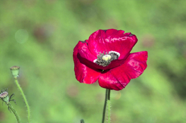
Just to piggy back on Pieter12, I would go with a Sigma Favon sensor, SD15, the early modes are experiencing too many issues if you have deeper pockets a SD1. The new Sigma no longer use the Favon sensor.
 

Attachments

  • Desert Botincial Garden Red Poppy .jpg
    Desert Botincial Garden Red Poppy .jpg
    160.3 KB · Views: 20

Oldwino

Subscriber
Joined
Jun 6, 2014
Messages
665
Location
California
Format
Multi Format
Although Eggleston is widely thought of a user of Kodachrome, he actually only shot that film for a brief period, around the “Guide” photographs. He used much more color negative film (Kodacolor) in his career, and found overexposure gave him the color palette he wanted. Of course, dye transfer printing gave him the color density he enjoyed.
 

roundcloud

Member
Joined
Nov 27, 2014
Messages
36
Format
35mm
The emulsion design of Kodak Ektar film likely follows an older formula from many years ago, which in theory should align more with that "nostalgic charm." The 1990s itself was an era of aesthetic pinnacle, after all. However, it’s regrettable that the tonal color performance of Kodak’s recently produced Ektar and Portra films seems to have deteriorated significantly—the tonality has become flatter, shadows appear muddy, mid-tone transitions feel rushed, and they even fall short compared to Ultramax 400. I wonder if others have noticed this issue. If this is indeed the case, the realm of film photography may face a decline. Attached below are two Ektar examples I developed and scanned a few years ago:

230820柯达ektar-0010.jpg

181104柯达ektarL-1150.jpg
 

koraks

Moderator
Moderator
Joined
Nov 29, 2018
Messages
20,622
Location
Europe
Format
Multi Format
The emulsion design of Kodak Ektar film likely follows an older formula from many years ago

I'd like to see a reference or an argumentation of this. It doesn't sound plausible to me. Note that there's no technical lineage that links short-lived Ektar 25 and present-day Ektar 100, as has been explained by Kodak employees several times.

However, it’s regrettable that the tonal color performance of Kodak’s recently produced Ektar and Portra films seems to have deteriorated significantly—the tonality has become flatter, shadows appear muddy, mid-tone transitions feel rushed, and they even fall short compared to Ultramax 400. I wonder if others have noticed this issue.

Simply put: no.
You may want to have a look here: https://www.photrio.com/forum/threa...400-does-anyone-have-the-same-problem.206352/
If you're running into color problems with Kodak films, a likely cause is CT irradiation during transport; either as people carried their film on a plane and took it through CT scanners themselves, or as a result of inappropriate logistics practices in commercial distribution.

ttached below are two Ektar examples I developed and scanned a few years ago:

Both show severe cutoff of the film curve and problematic color balancing. Simply put: that doesn't look like Ektar, and it's not because of the film.
 
Photrio.com contains affiliate links to products. We may receive a commission for purchases made through these links.
To read our full affiliate disclosure statement please click Here.

PHOTRIO PARTNERS EQUALLY FUNDING OUR COMMUNITY:


Ilford ADOX Freestyle Photographic Stearman Press Weldon Color Lab Blue Moon Camera & Machine
Top Bottom